Tuesday, 13 January 2015

Portraits and Illustrations

Today we did some Portrait drawing and sketching. I started off just doing some quick charcoal drawings, trying to get used to the shape, lines and tones of the face.


After doing these drawings I decided that I was trying to do them too quickly and I wasn't measuring or ensuring that everything lined up properly as the face looked out of proportion.

I spent the next couple of hours working on one drawing using a mixture of conte and charcoal. The chalk allowed me to use a lighter application and this allowed room for mistakes as they were easily over come by just re-applying the conte where it needed to be. I then used the charcoal to darken the areas that created a lot of shadow.


I think this was successful. I like the tonal shading I have created using the mixed media. The person I was drawing was looking down quite a lot (hense why she has her eyes closed in the drawing) and this makes the drawing look quite strange. I found it quite difficult drawing such a detailed thing when the person was moving quite a bit as she was working at the same time. I think I would take more time over facial features if I were to do this again and try and draw the person with their eyes open, it would make the drawing a lot more inviting and open.

After doing a detailed drawing we had to do drawings which reflected the personality of the person we were drawing through an illustration...
 
 
I know Emily for her big hair, eyes and lips. She's very welcoming and will talk to anyone. I tried to reflect this through this quick drawing. I think it's friendly and demonstrates her natural looks. I preferred the drawing before I worked into it and started shading areas. The simple line work was really effective but with some areas block coloured it's more heavy and not as delicate as I would have preferred it to look.
 

Friday, 9 January 2015

Life Drawing

After not doing any life drawing for a little while we started with doing quick 10 minute drawings using different media to get used to it again.

I think I did better using my brush pen. I had more of a fluid movement and it was easier to shade in the darkest areas (top left, top right and bottom right). On the bottom left image I used a fine liner pen which didn't allow me to have such a fluid movement which meant I had to be more careful where I applied the pen line as mistakes were very noticeable.

I most like the bottom right image. I used a grey brush pen to map and shade the majority of the image and then used a black brush pen for the darkest area's. I think this way of applying the media gave the image more depth and also made it easier to identify and apply to the darkest areas.


I decided that I really liked using the grey and black brush pens together so I decided to do another sketch in that style. We had a bit longer (20 minutes) to do this sketch which allowed me more time to do it a bit bigger and also get the whole body in the image. They're a lot more effective when you include all the body parts. I feel like I need to spend a bit longer measuring and making sure I get everything in proportion  as the right leg doesn't look right and the arms look quite short. I'd like to be able to shade more as well. I also need to concentrate on the areas that are more difficult to draw like the feet and hands as I feel this is letting my life drawings down.

The second image didn't really work. None of the body is in proportion, I think this is because I didn't allow myself enough room to work on the page and I may have just squished it in the bottom as none of the body parts match up correctly. I need to bare in mind for future drawings to give myself enough room to work.


After not giving myself enough room on the sketch before, I tried again on a fresh piece of paper with a new pose. I decided to use the grey brush pen for mapping out the main sketch of the pose. Then used a black brush pen for the darkest areas and a blue brush pen for the highlights. I feel like I knew what I was aiming for in this image but it wasn't as successful as I had hoped.
I think I should have spent longer drawing out the body and getting everything in proportion before I began shading it as the body looks very large in comparison to the legs which I feel should have been longer and wider because of the position the model was sitting in.


I felt like I was getting tired of using the brush pens and that I wasn't getting things in proportion very well, so I changed to a different type of media.
I moved on to using Conte. With this media it was much easier to measure and draw the lines out straight, then go back in and curve the lines into the correct positioning. It also made it easier to use different levels of shading as some parts of the body only needs light shading whereas other parts are very dark. I still think I need to take more time to ensure everything is in proportion, I need to use some guidelines to ensure each part of the body lines up correctly and take more time drawing in smaller details, especially on the feet and hands.

Experimenting with Colour


I was really excited that we had the opportunity to use colour. I did this image using oil pastel. I used this media as I can really capture the vibrancy of the colours and blend together the pastels to create different shades quite easily.
I'm really pleased with how this turned out. Oil Pastels can be quite messy but I feel I managed to keep this quite neat and tidy. It's easiest to apply the lightest colours first as its easy to go over light pastels with darker ones but not so easy to go over dark pastels with light colours.
Most of the colours required 2 or 3 different pastels so I had to play around with a few before applying them to the image itself to ensure the right colouring was achieved.

In the image on the left I used colouring pencils. I feel like I could keep the colours very crisp using pencils as they aren't very messy. In only a couple of areas I had to use a couple of different pencil shades to create the shades on this sketch.
I used water colour for the image on the right. I think I should have used a couple of layers of paint on the blue as it's not as bright or piercing as I would have hoped it would have been. However the yellow and red in the centre are very clear which I'm pleased with as it's very vibrant.

I really liked the shades of pink I created in the oil pastel drawing. I took an image that doesn't have much colour in and applied the different shades of pink into the image to see how the shades work with something that isn't usually colourful.
I really like how this turned out. The pinks work really well. However, I would like to have seen how this looked using only the shades of pink and no purple or orange. I don't think the colours compliment each other well in this format and also the beak is orange anyway in the real picture so I would have preferred it
if I changed it all completely.  


Creating Illustrations from Mapping a Journey


We were set the task of mapping a journey from one place to another. We could choose where we went, we just had to draw what we saw. I went to the university's Library and one thing I noticed was the endless amount of doors. There were a mixture of really old doors and new doors so I decided to focus my drawings on these.

After drawing doors there was two areas that caught my eye. One was a window that let in a lot of light and on the window sill there was a plant that was reflecting the light from the window and also creating shadows with it's leaves.


I also noticed on the skirting boards there were these dark shapes cut out from the wood, that sort of looked like mice holes.
 When we got back to class our second task was to create an illustration/story from the drawings images we captured. I thought about the doors for a little while and tried to work out how I could incorporate all the doors into one illustration. I liked the idea of doors opening so decided to layer the doors and cut them so that each door could open, giving it a sort of maze effect, not knowing what you'll open the door too next. Once you've opened the last door you are faced with the dark 'mouse hole' shape. So you'll never know what's at the end, apart from a dark whole, this gives it a bit of mystery and allows the mind to come up with an ending.


I think I should have used a bit of colour in this illustration as it's quite boring in grayscale and also colour would have made the end point (if kept in black and white) more effective. I also think I should have done something with the back of the doors as the plain white takes away from the effect of the doors. If I'd made them look like doors on the back as well then the effect of doors opening would have carried on the illusion.
Despite these points I do really like the idea of this illustration. I think it's more interesting than what a flat drawing would have been.  
 

Mapping Journeys


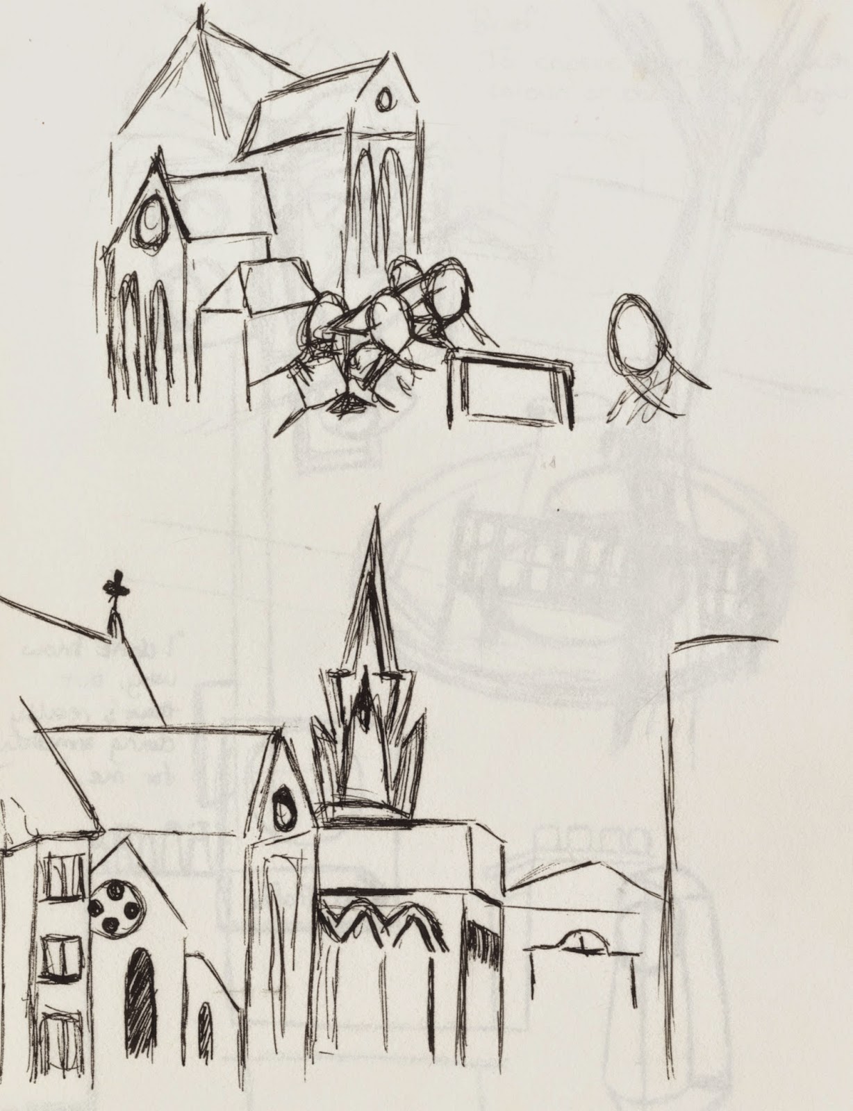
We were set a journey to walk and to draw what we saw as we went. This journey was through town starting at Imperial Gardens and ending at the university. I started off drawing things that stood out, so there was a statue and old buildings...


Once we'd gotten back to university we had to set ourselves our own brief. I decided I wanted to focus on objects that reflected light and colour and then make an illustration that incorporated these things. So I went back out and walked the journey again, drawing a number of things that reflected light and colour. So I found traffic signs and bollards, traffic lights, buildings and crockery from a coffee shop.

We then had to come up with an illustration using the things we'd found.


The ideas I came up with was four different illustrations showing the different seasons of the year. In each image there would be a set of traffic lights and they would move to a different position with different lights showing as the images change. There will also be a tree in the background of each illustration and the tree will reflect the season. Each image also has an object of main focus, this object can be lifted (sort of like a pop-up book) to reveal the season written underneath, this making it suitable for children to assist with learning of seasons of the year.


These are examples of one of the illustrations and how they would work. I think I should have done more thumbnails of each illustration as I don't think the composition works 100%. I could have had the statue and traffic lights on opposite sides as having the statues back to the traffic lights doesn't really work, it's like the illustration is stuck from progressing. I also think the tree would have been better off centre. It's too central and causes the illustration to appear dull. 


Pittville Pumprooms


We went  to Pittville Pumprooms which is a large old building and we had to draw it from different perspectives.


I found this quite difficult as the building is so large I didn't know where to start. I definitely need to practice drawing buildings more, I think the last image is most effective as it shows more detail than the other images and the measurements are more realistic than the other drawings.